MATAS Group
Product Design

Matas Group is a leading Nordic health and beauty retailer. The project focused on creating a clear, user-first website experience that aligned seamlessly with a strong, established brand.
I was the sole Product Designer on the project, responsible for shaping the experience end-to-end — from early discovery through to final mobile and desktop designs.
The Challenge
Matas Group needed a website experience that felt as considered and premium as its brand, while remaining clear, intuitive and easy to navigate across a wide range of products and content. The challenge was to bring clarity and structure to the experience without losing the simplicity, warmth and trust associated with the Matas brand.
UX audit of the existing experience
Competitor and market analysis
Sitemap and information architecture
Wireframes
Mobile and desktop UI design
Close collaboration with the branding team
UX Audit & Sitemap
To ground the work, I began with a UX audit and competitor analysis, identifying usability issues, content gaps and opportunities to improve clarity and consistency.
Using insights from the audit and analysis, I reworked the sitemap to create a clearer, more intuitive structure helping users find content and services with less friction.
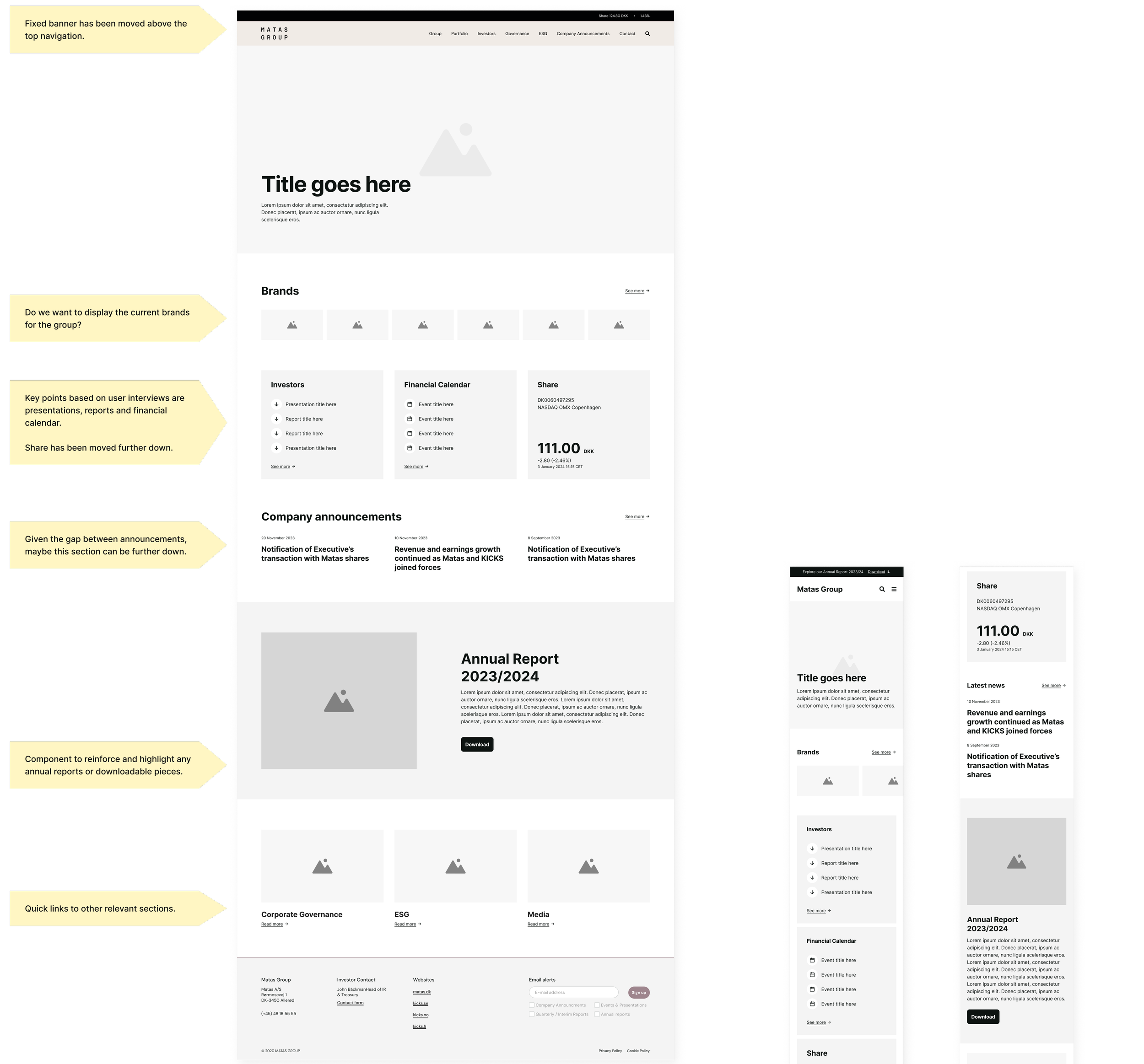
Wireframing & UX Foundations
Wireframes were used to validate structure, hierarchy and flow before introducing visual design, ensuring the experience worked at a functional level first. A strong focus was placed on intuitive navigation, clarity of purpose, and accessibility to ensure a seamless experience across all devices.
Clear page hierarchy
Consistent layout patterns
Focus on ease and clarity
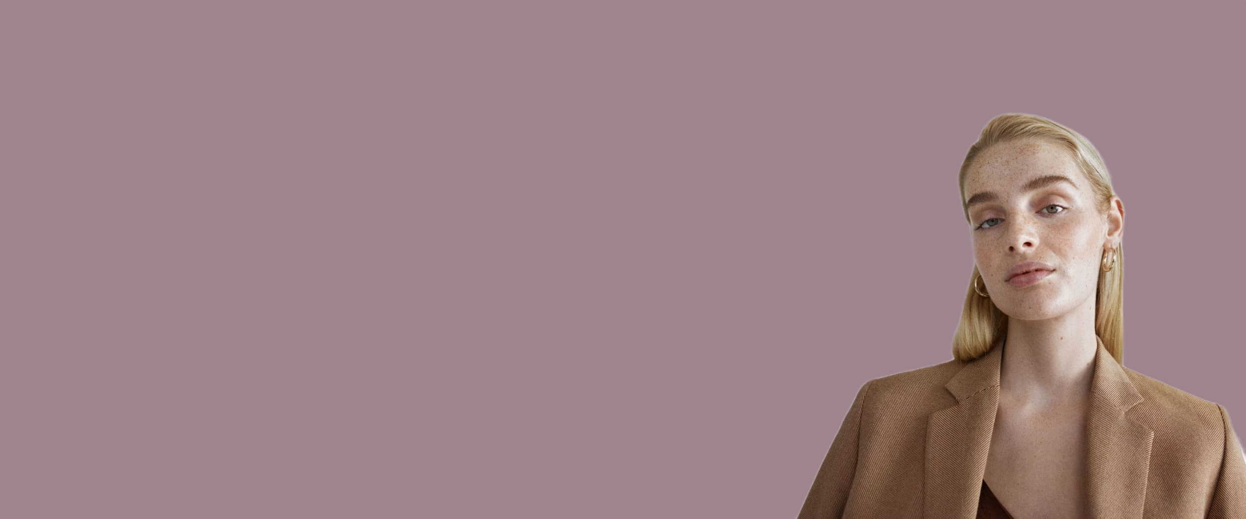
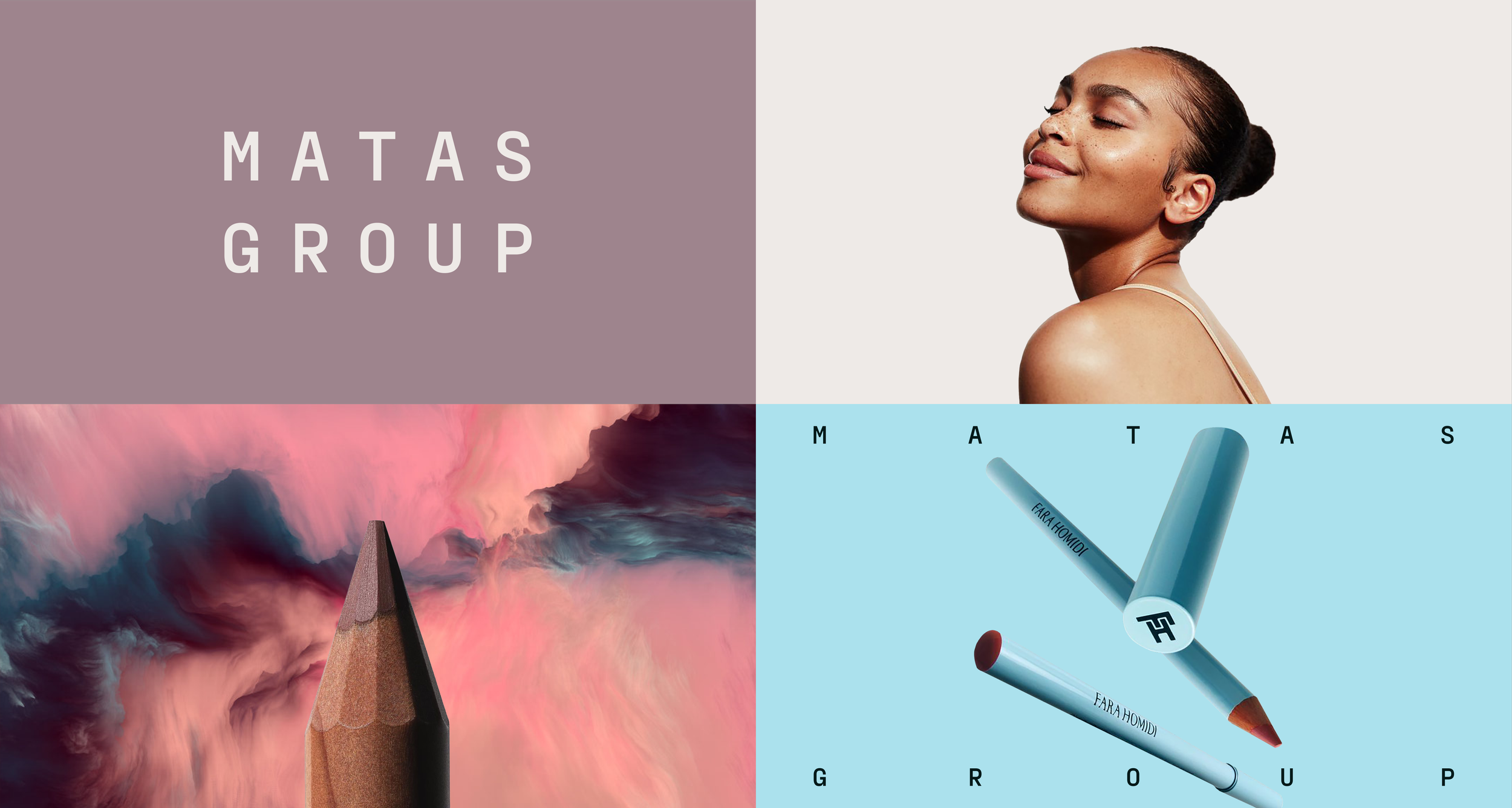
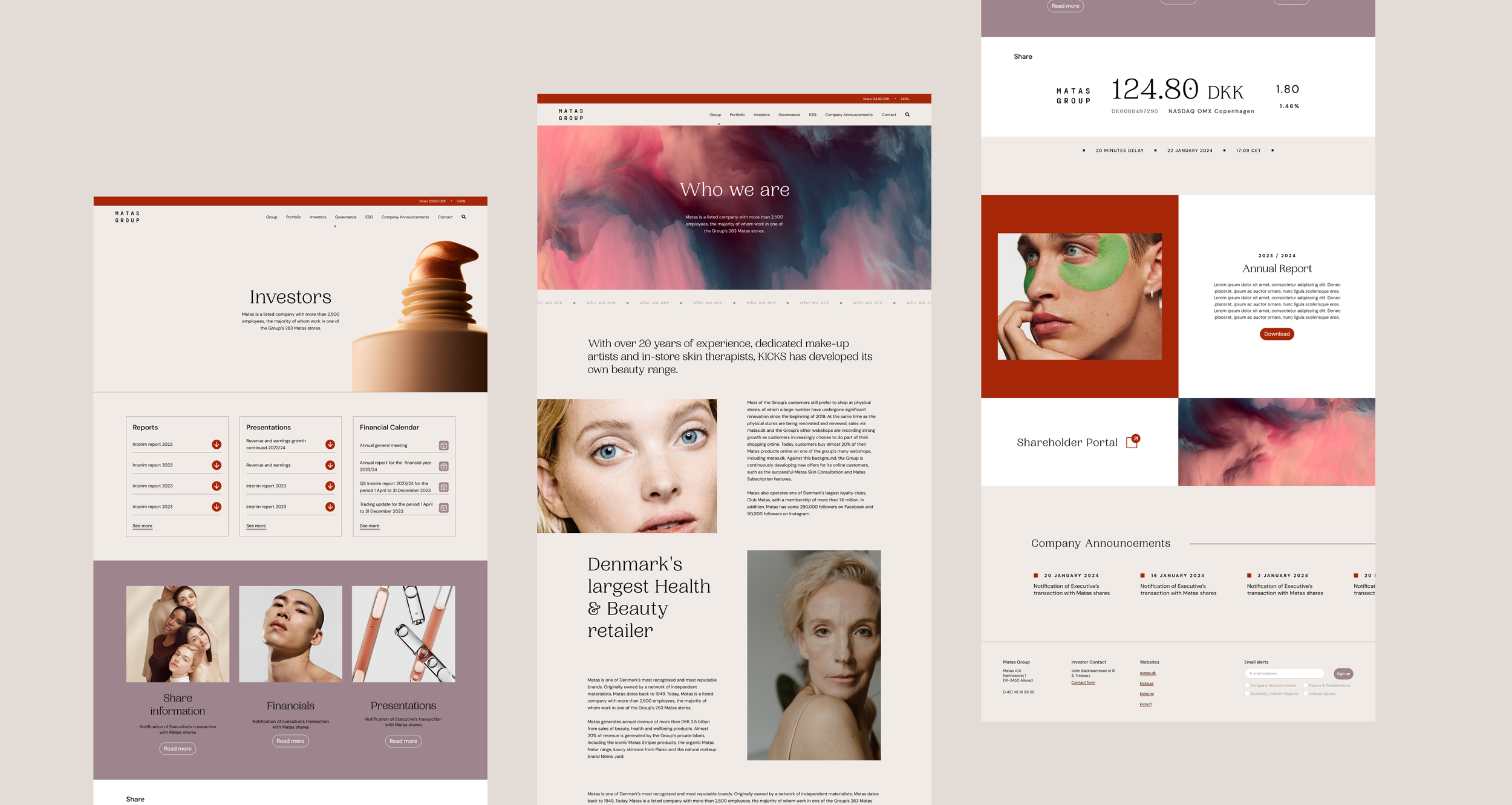
Brand & Visual Design
Working closely with the branding team, I translated Matas Group’s clean Scandinavian aesthetic into a digital experience that felt calm, confident and considered without compromising usability.
Focus areas
Clear typography and spacing
Soft, restrained colour usage
Consistent UI patterns
Balance of content and whitespace
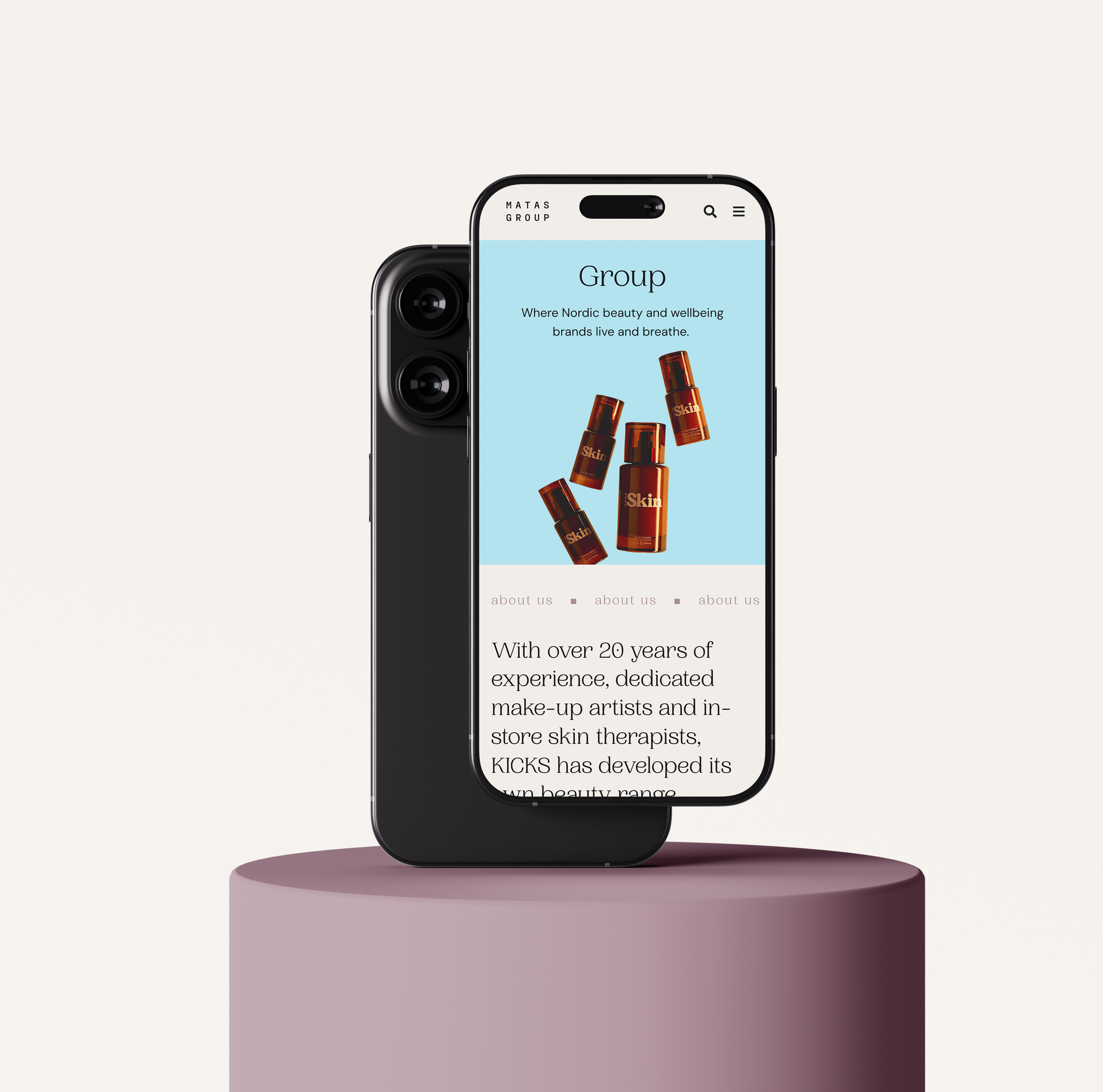
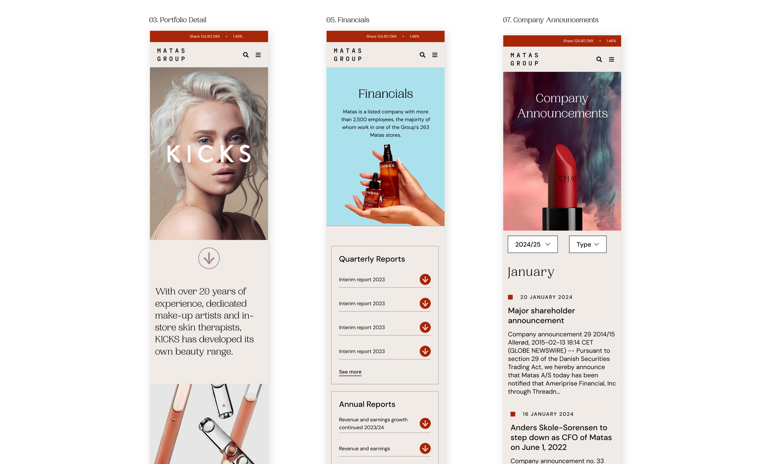
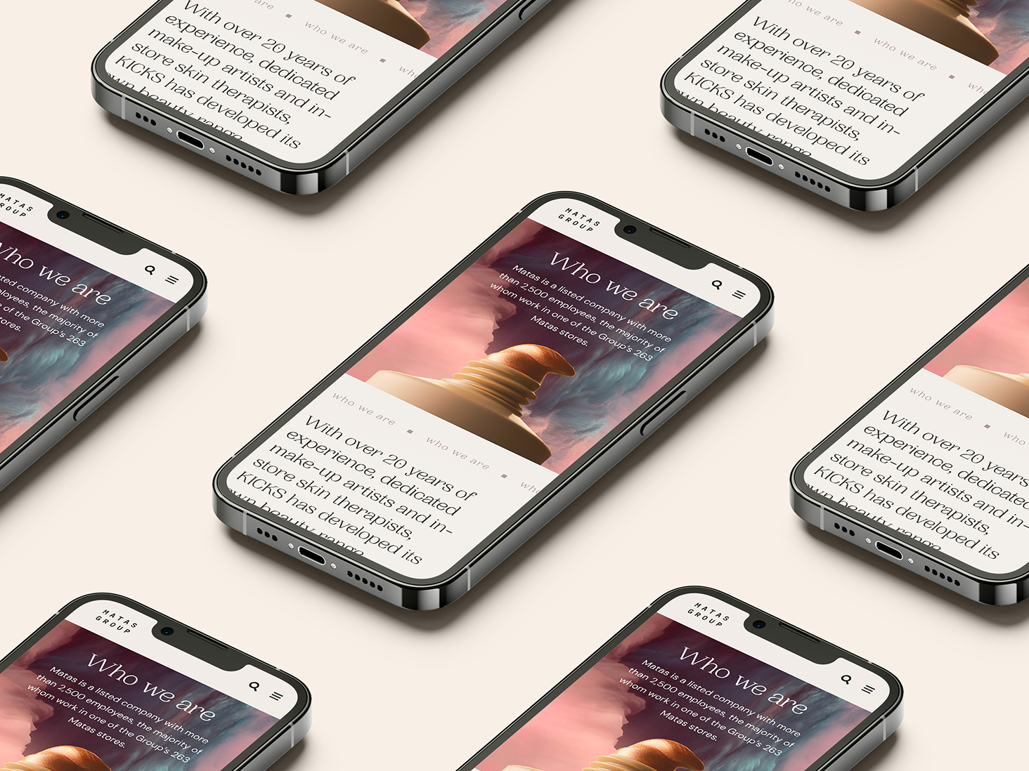
Responsive Design
The experience was designed responsively from the outset, ensuring consistency, clarity and ease of use across devices.
The final designs delivered a clear, user-first website experience that aligned with Matas Group’s strong brand identity, providing a scalable foundation for future digital growth while maintaining a distinctly Scandinavian feel.