Blue Light Card
Product Design
Blue Light Card is the UK’s dedicated rewards platform for people working in the emergency services, NHS, social care, teaching and the armed forces. With thousands of brand offers available, the challenge was helping members quickly find the best possible discount, even when the brand they searched for wasn’t available.
My task was to improve search and discount discovery, highlighting the best-value offers, reducing ambiguity around redemption, and supporting both decisive and exploratory shopping behaviours.

The Problem
Members often arrive with a clear intent ~ brand, product, or type of purchase in mind. When that brand wasn’t available on Blue Light Card, search results frequently felt unhelpful or unclear, leading to drop-off and missed opportunities to surface better-value alternatives.
At the same time, even when discounts were available, users struggled to quickly understand which offer was the best value, What the discount actually applied to, and where and how it could be redeemed. This resulted in friction at key moments in the shopping journey.
Users & Insights
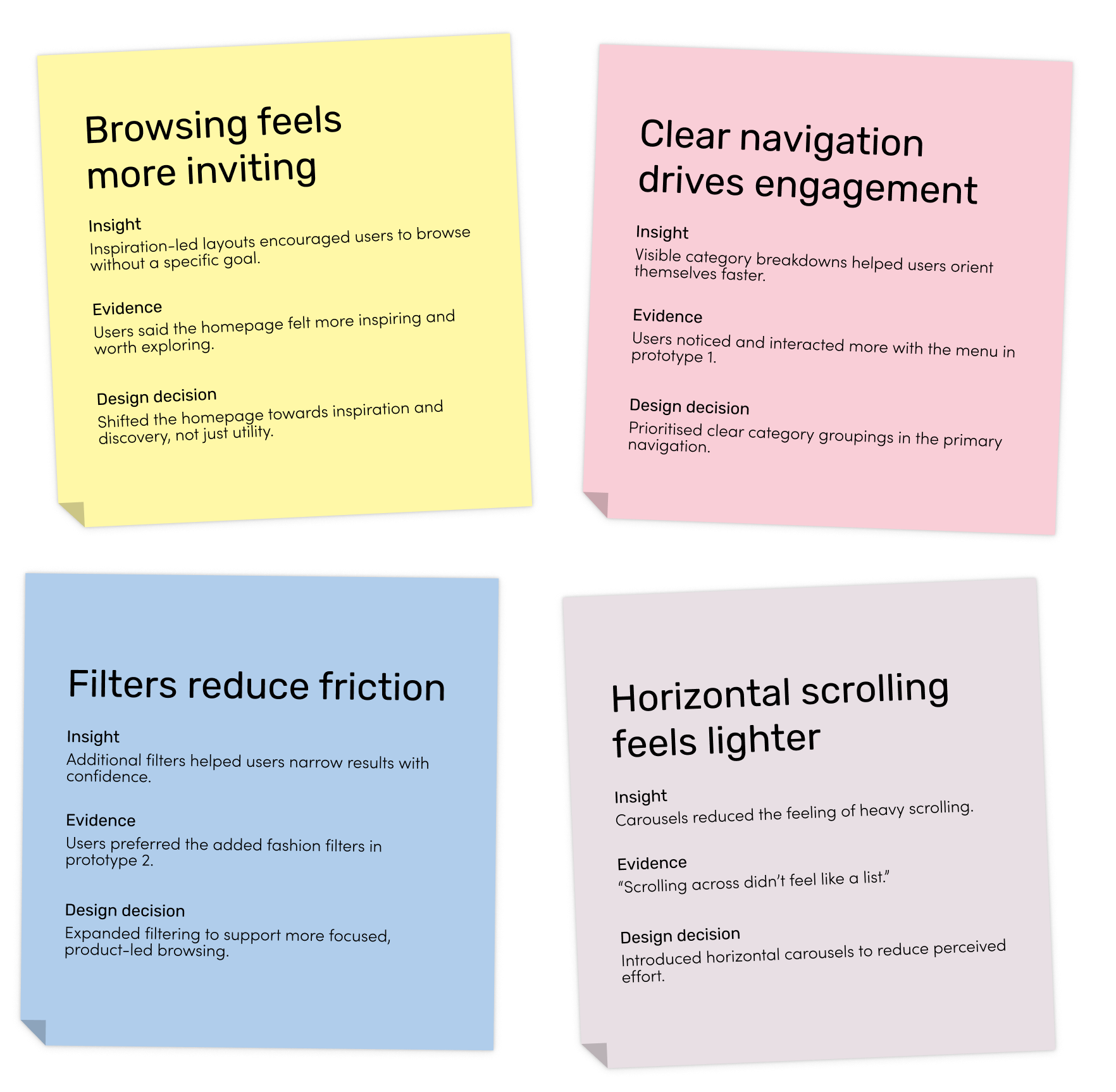
Working closely with a researcher, we identified three core user types:
Brand-led: checking for a known discount
Product-led: comparing where to buy
Explorers: browsing for inspiration
Across all groups, users wanted value upfront, easy comparison, and clear confirmation they were getting a genuine deal.
Users weren’t just searching for discounts — they were searching for confidence they were getting the best value.
Designing for intent, not just availability
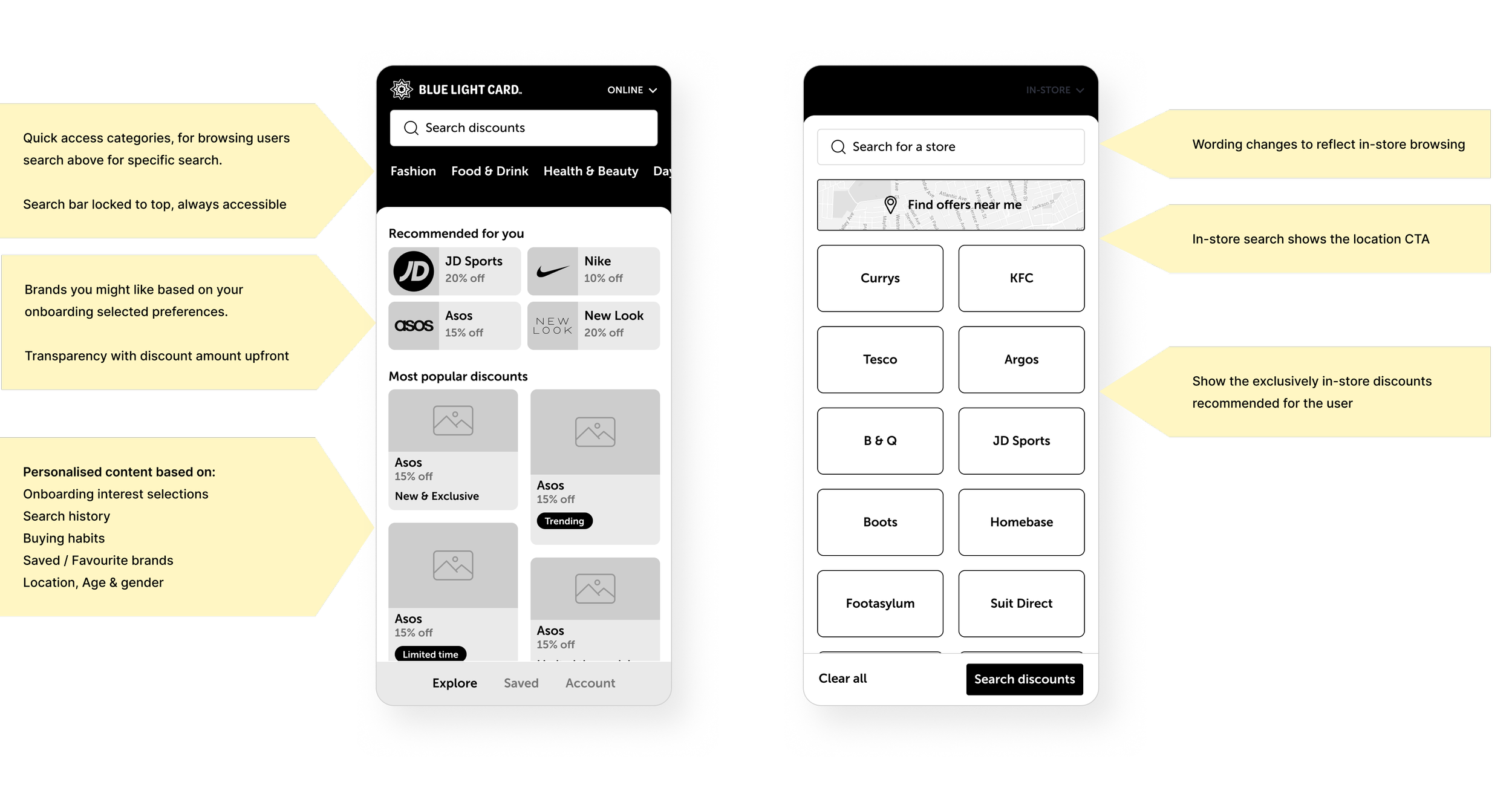
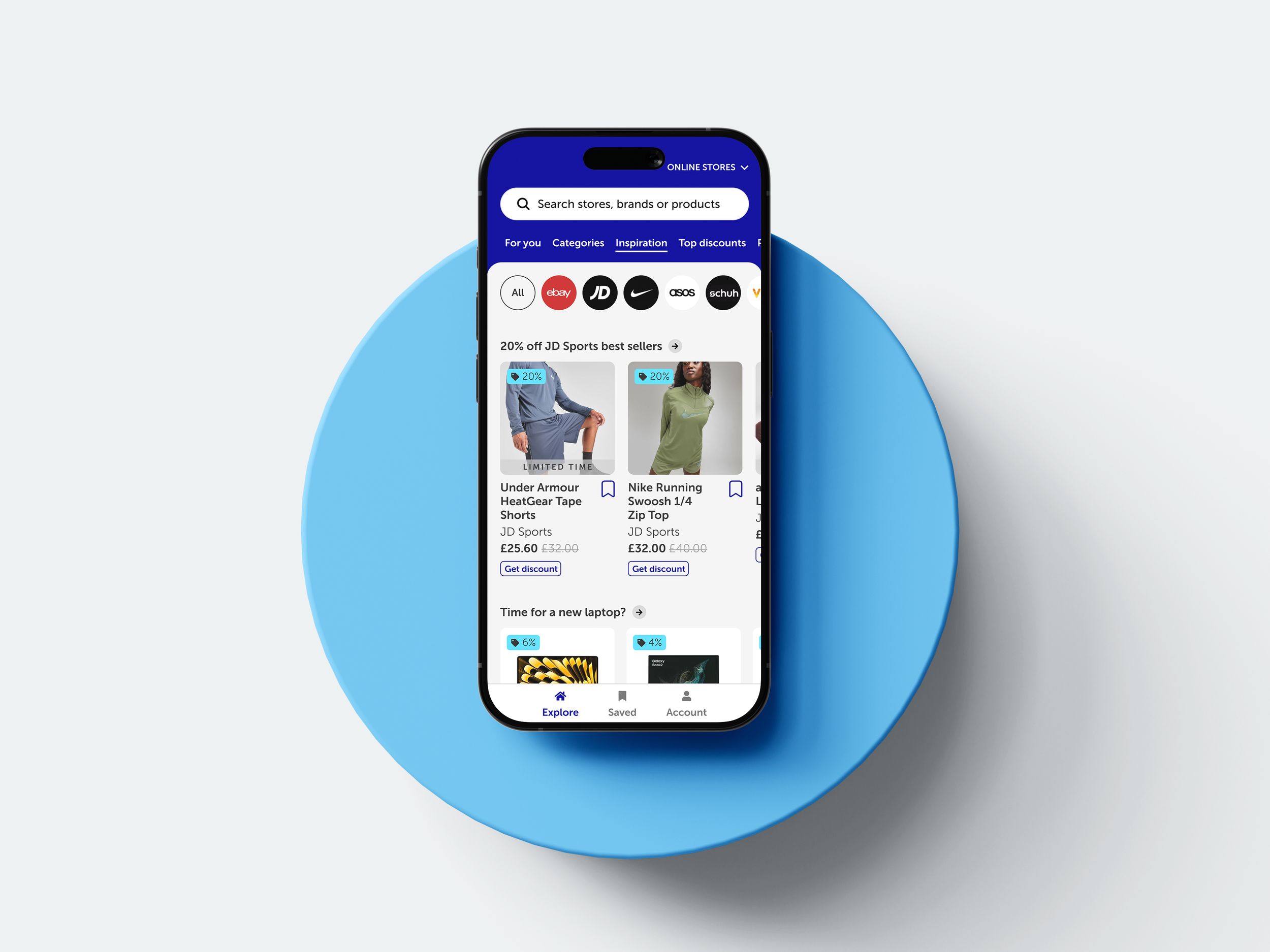
I focused on improving search results, offer clarity and visual hierarchy, balancing UX improvements with a refreshed UI layer.
Brand + product-led search behaviour
Value-based result ranking
Clear “best deal” indicators
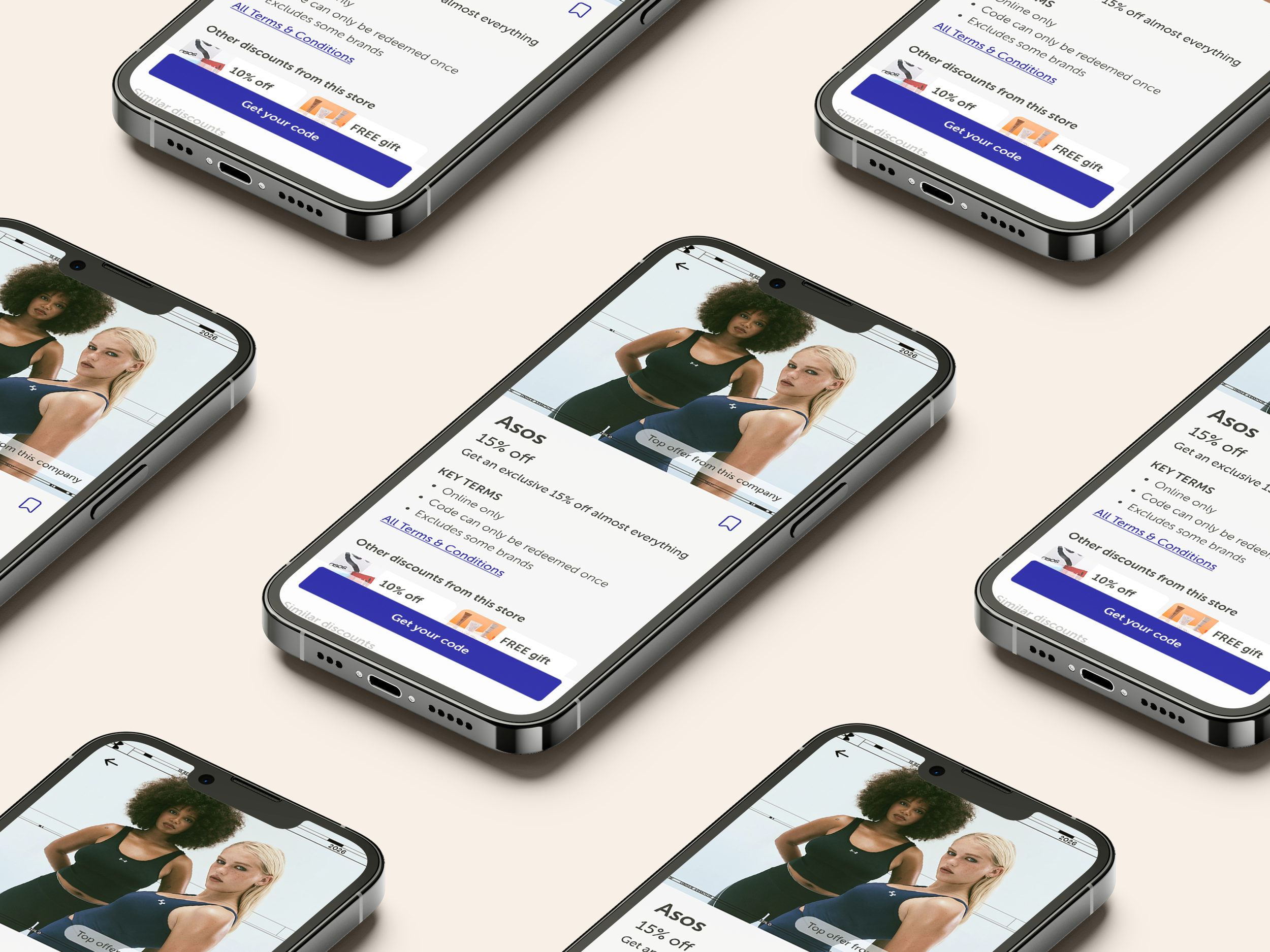
Simplified redemption clarity
Search Improvements
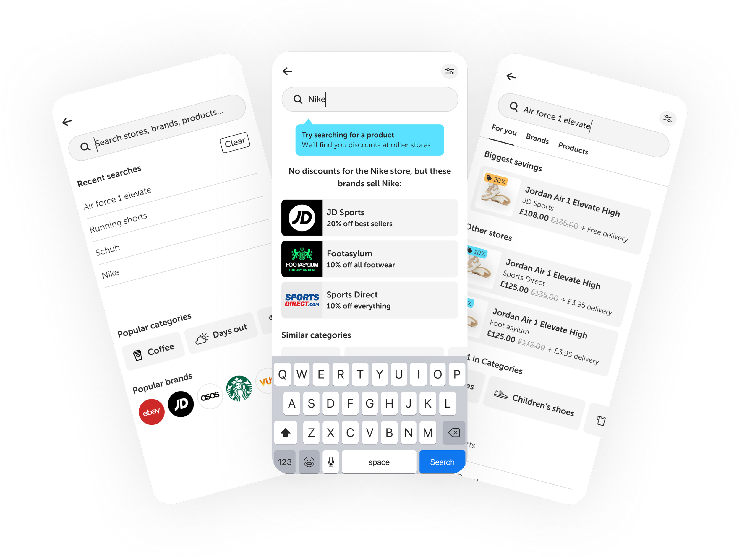
Improving search when brands aren’t available.
Instead of dead ends, search guides users toward relevant alternatives that still match their intent.
Product prompts instead of brand-only results
Similar categories and top alternatives
Social proof via “people also used”
Popular competitor offers surfaced
Best Discount Discovery
Helping users find the best discount
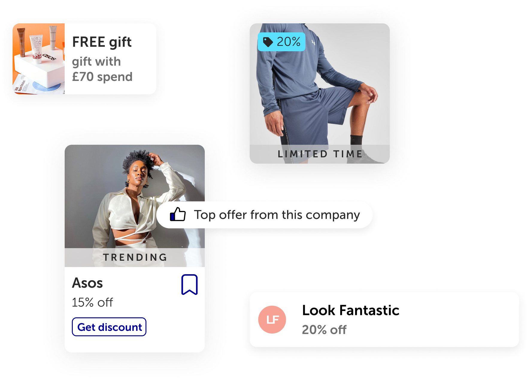
Offers were redesigned to be scannable and comparable at a glance.
Best deal surfaced first
Clear labels (Best value / Biggest saving)
Supporting context (delivery, exclusions)
Social proof
Subtle nudges highlighting better savings
UI Refresh
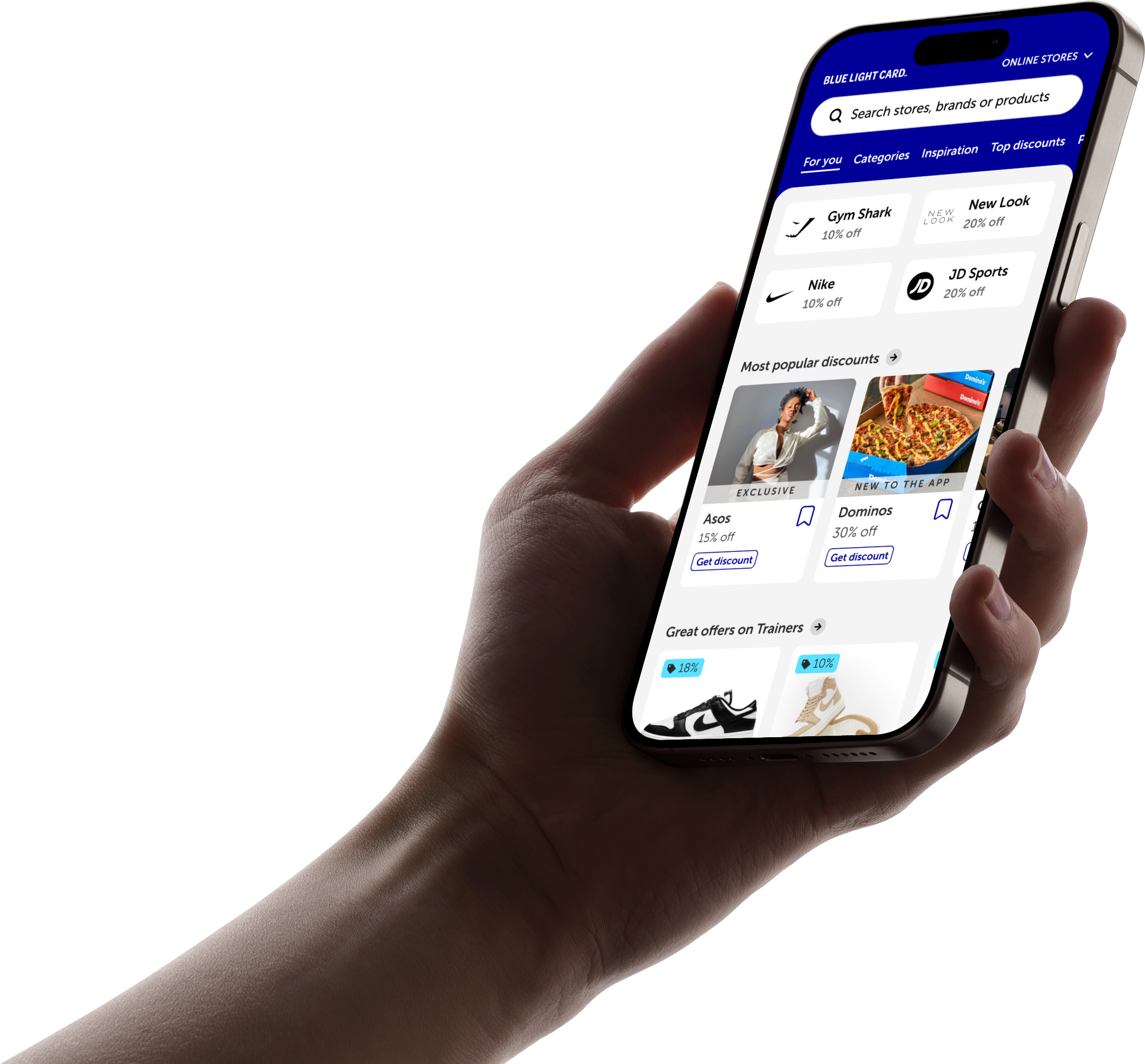
A refreshed visual layer improved clarity, hierarchy and trust, making discounts easier to scan without losing brand familiarity.


